Service Design Toronto
SDTO is a community dedicated to promoting and exploring Service Design, a practice that brings together research, strategy, UX, systems thinking and communication design.
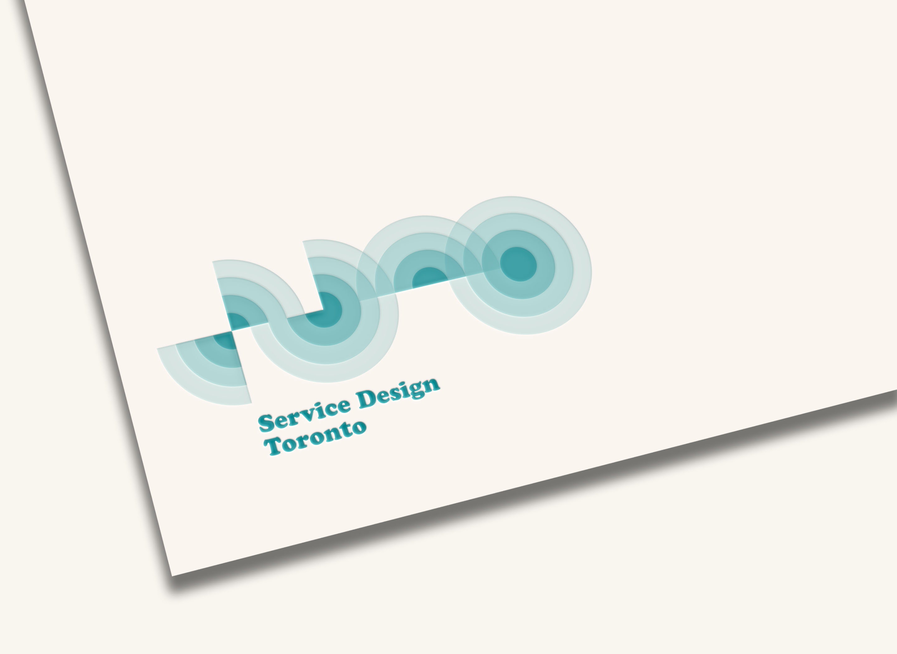
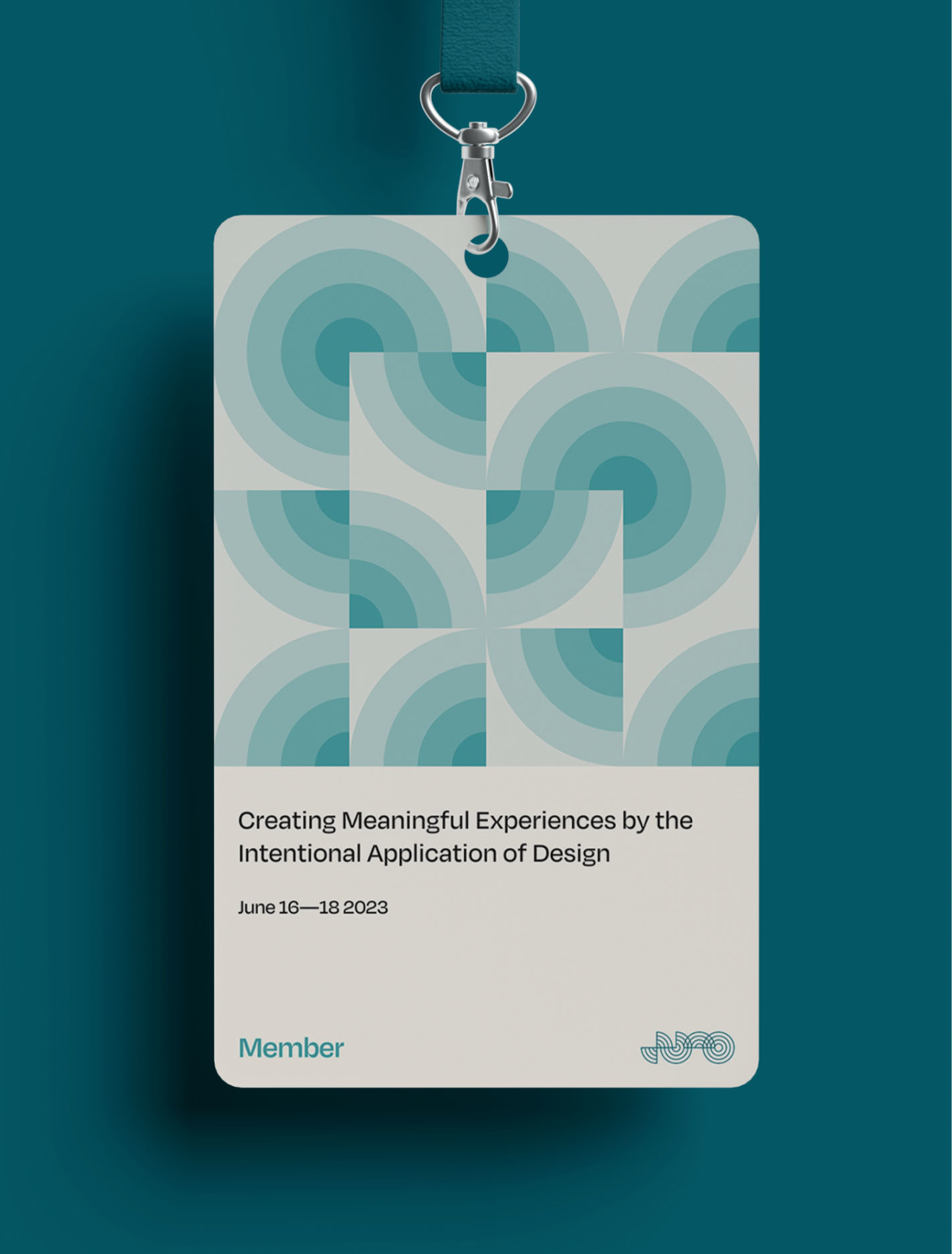
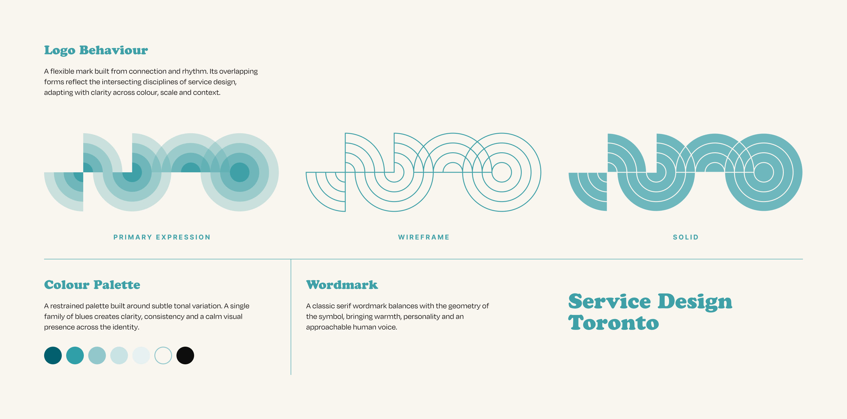
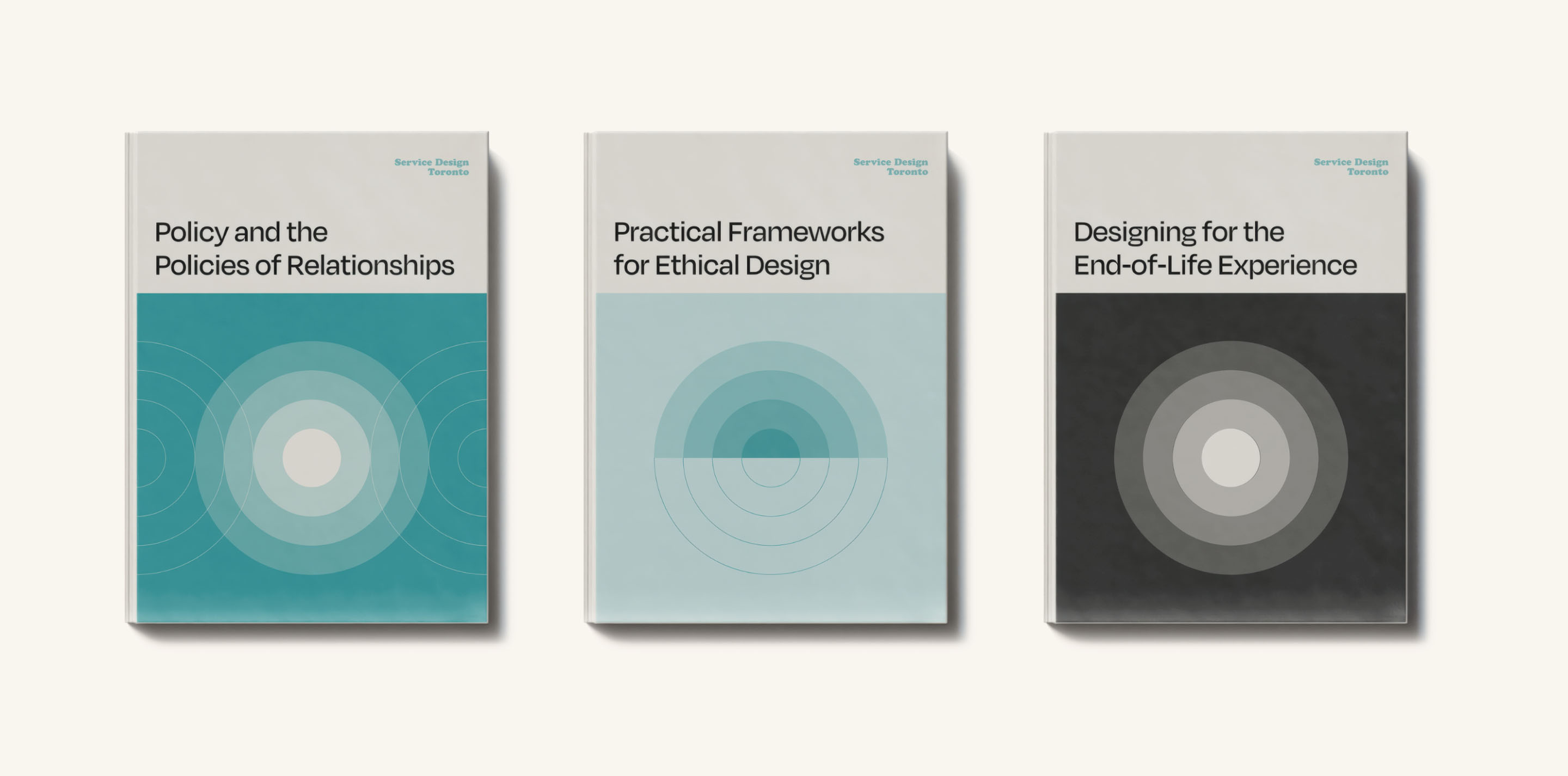
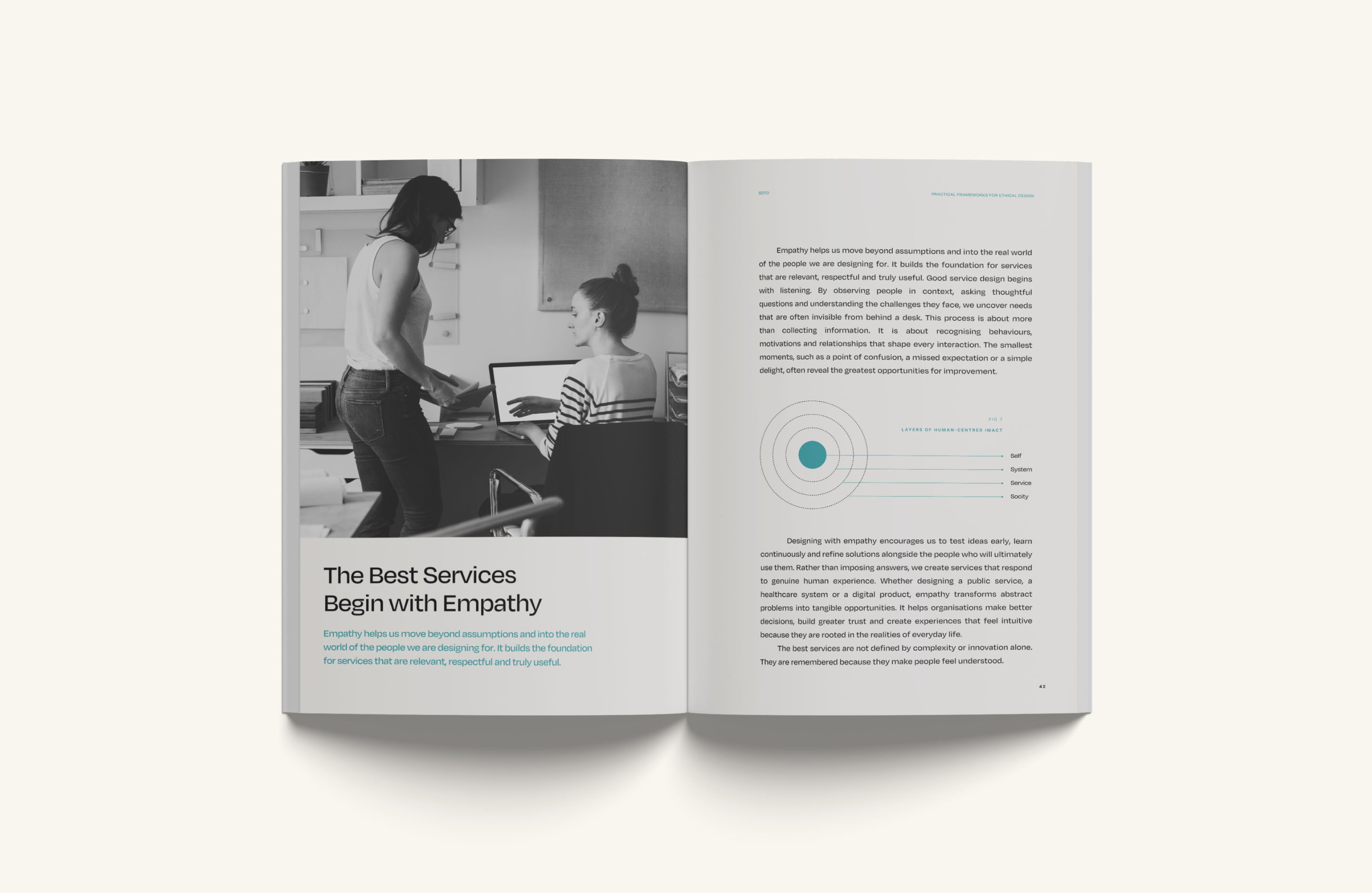
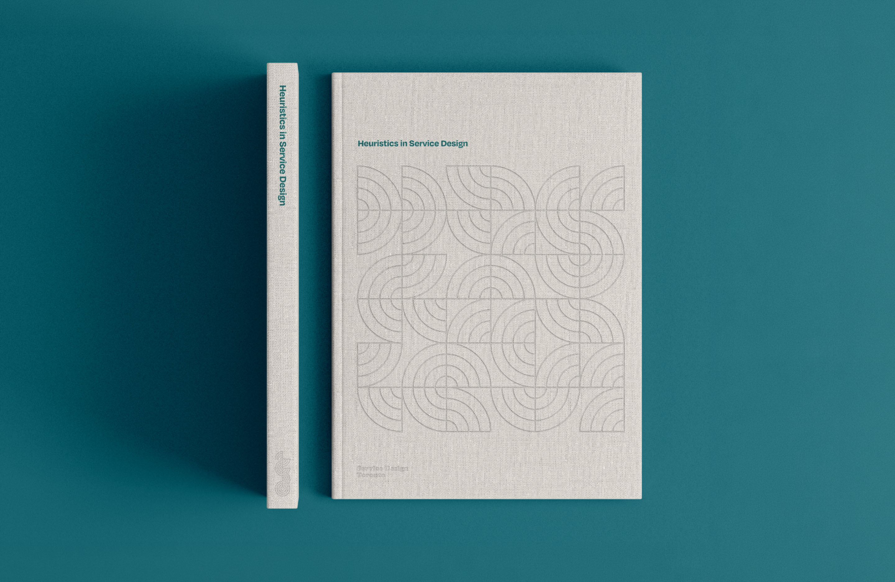
The identity reflects the way these disciplines overlap and intersect. The logo is constructed from four sets of concentric circles, which can separate, layer and recombine to create a flexible graphic system. A tightly controlled palette of layered teals adds depth while allowing those relationships to remain immediately visible. Secondary graphics and illustrations take inspiration from Pelican Books’ cover designs of the 1960s and 70s, using the same circular geometry as their starting point.
An intentionally limited range of elements encourages variation and creative problem-solving, demonstrating how clearly defined boundaries can generate a surprisingly broad visual language over time.
Simon is a true creative with a strong and detail-oriented vision. The brand he created for Service Design Toronto has served us well for many years.Linn Vizard, Co-founder, Service Design Toronto