DVAS
The Deadly Viper Assassination Squad is Toronto Roller Derby’s farm team. This rebrand came during a broader period of reinvention for roller derby, as the sport began moving beyond the familiar rockabilly and American Traditional aesthetics that had helped define it, but were also making it feel increasingly niche.
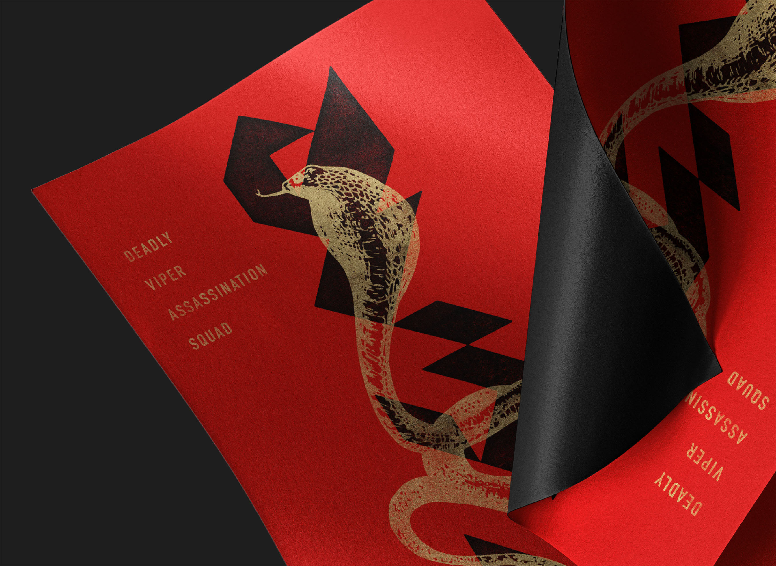
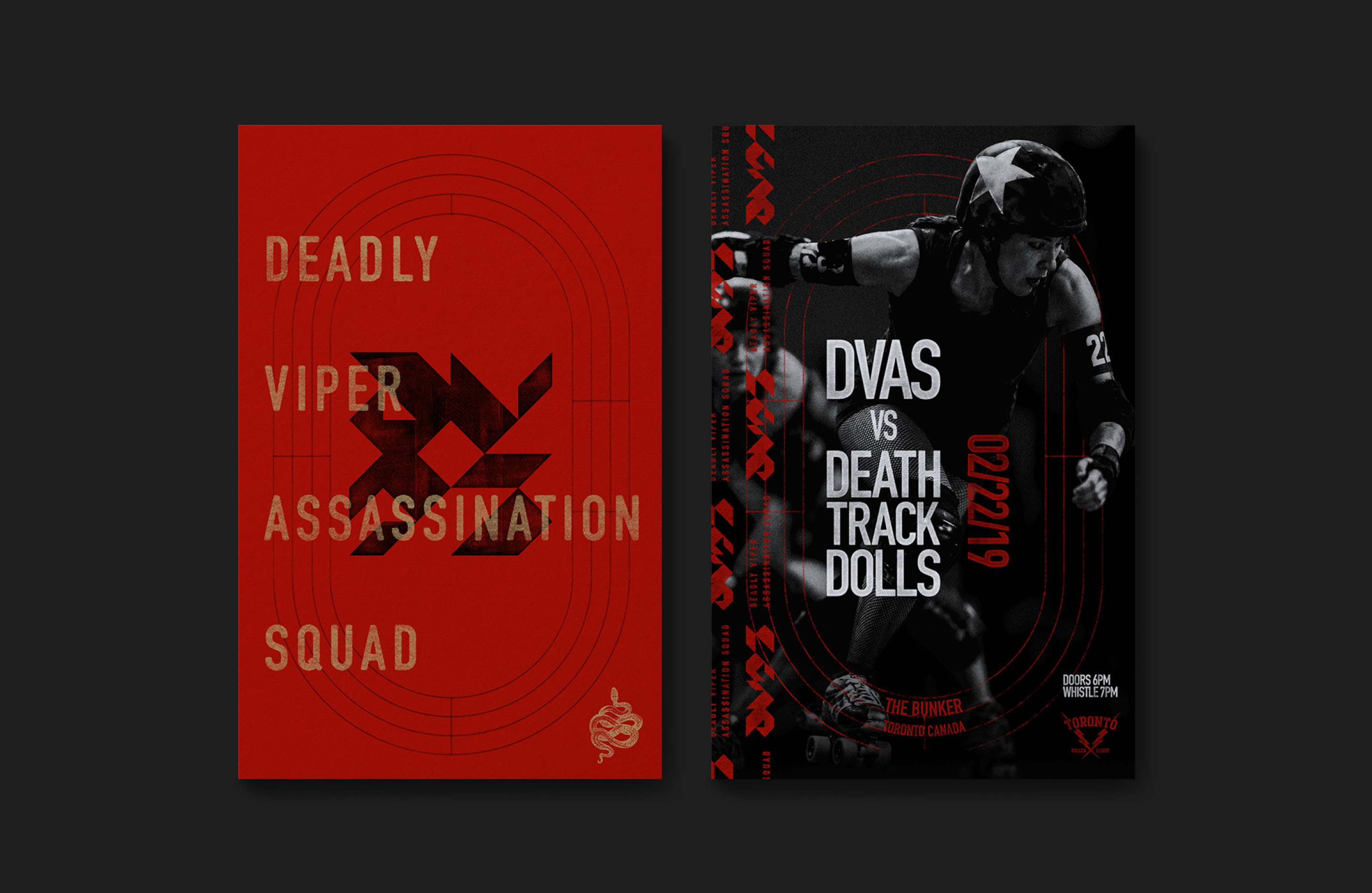
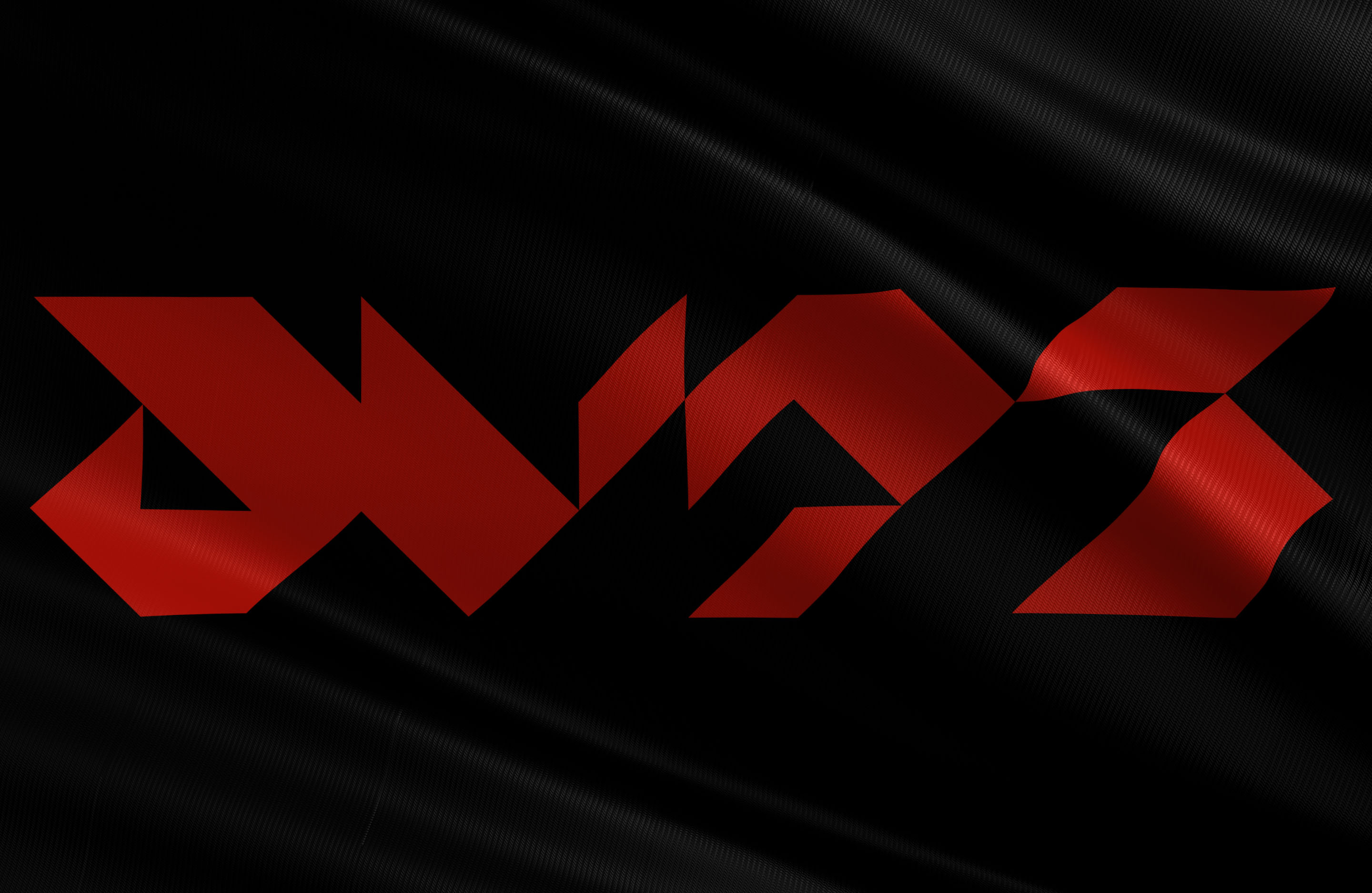
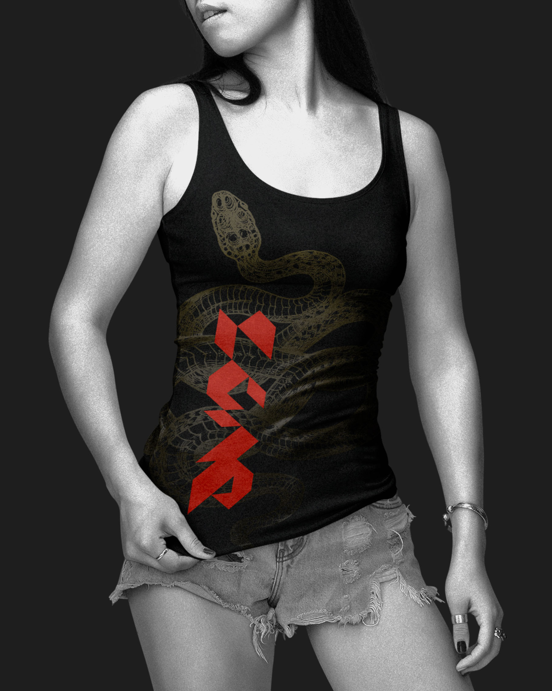
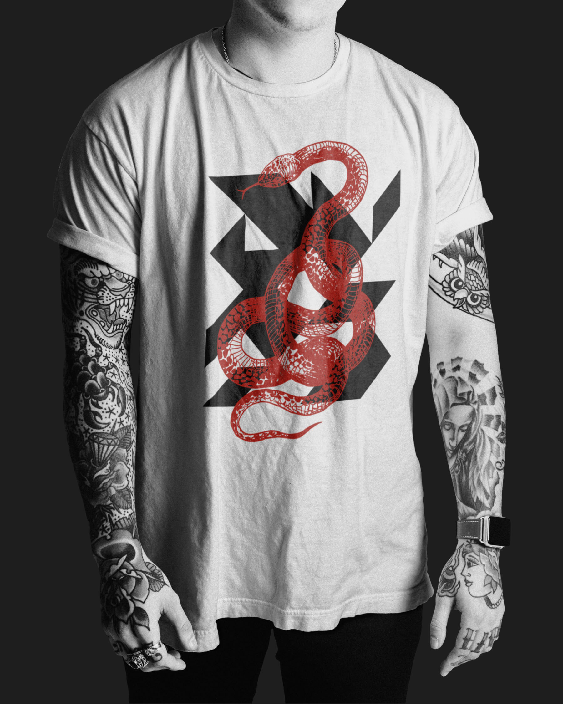
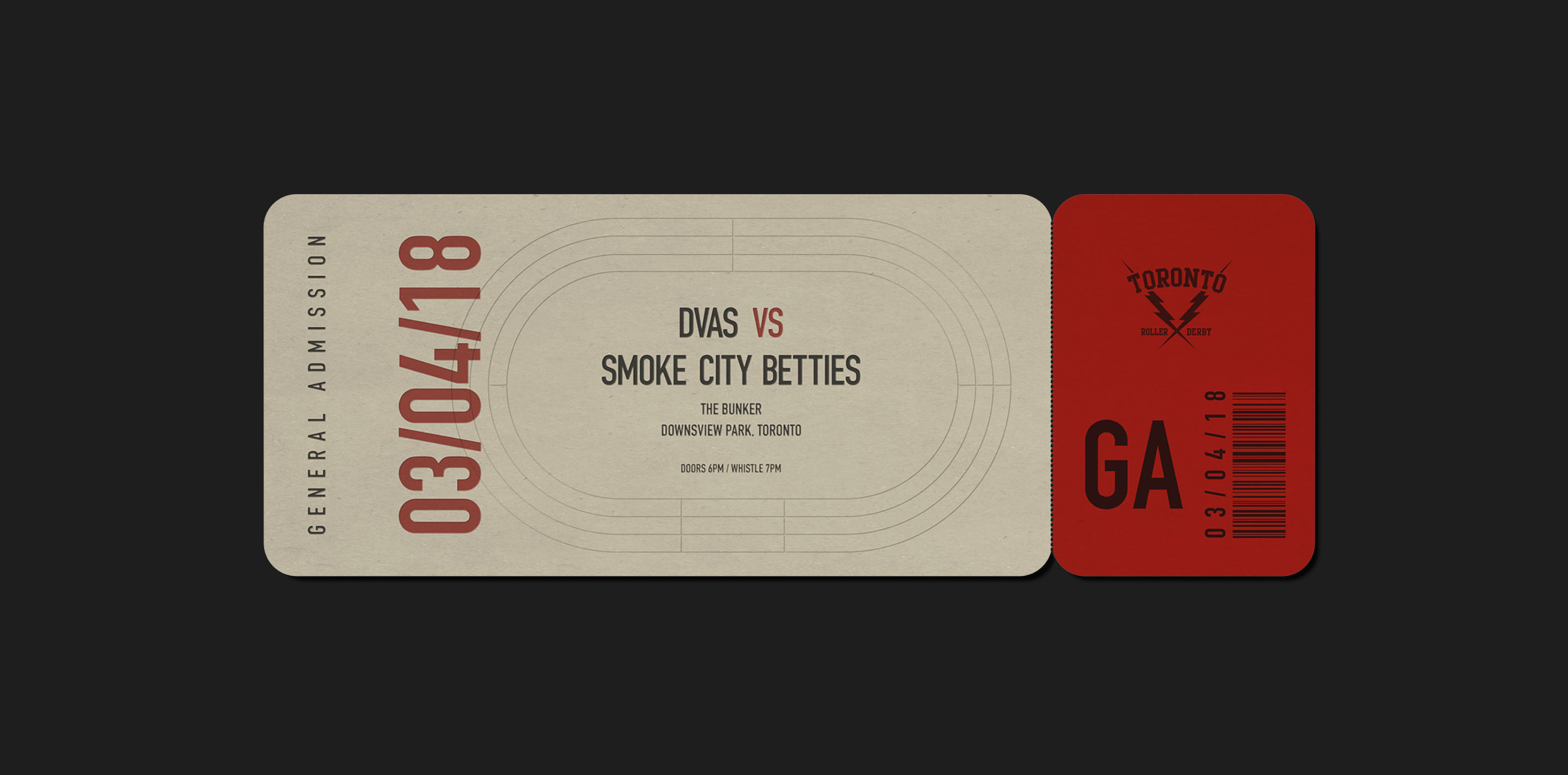
The new identity retains roller derby’s outsider aggression without relying on those established tropes. Constructed entirely from a grid of right-angle triangles, the modular wordmark is sharp, powerful and uncompromising. Illustrated snakes maintain a connection to the team’s name and history, while the oval geometry of the track becomes a flexible graphic element throughout the brand.
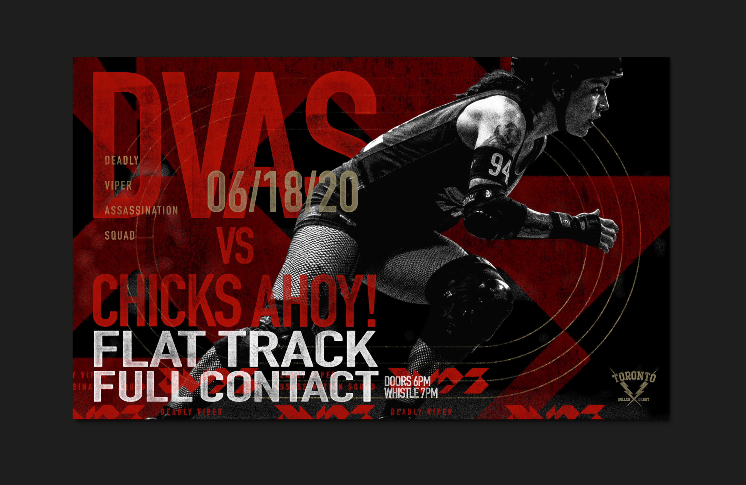
Typography is treated similarly. Words are oversized, cropped, repeated and densely layered, creating visual rhythm and intensity rather than simply delivering information. Distressed surfaces bring a physical quality to an otherwise highly geometric system.
The resulting brand reflects roller derby’s growing appeal to a wider and more inclusive audience, while remaining as loud, intense and physical as the sport itself.