Mike Fuhr RMT
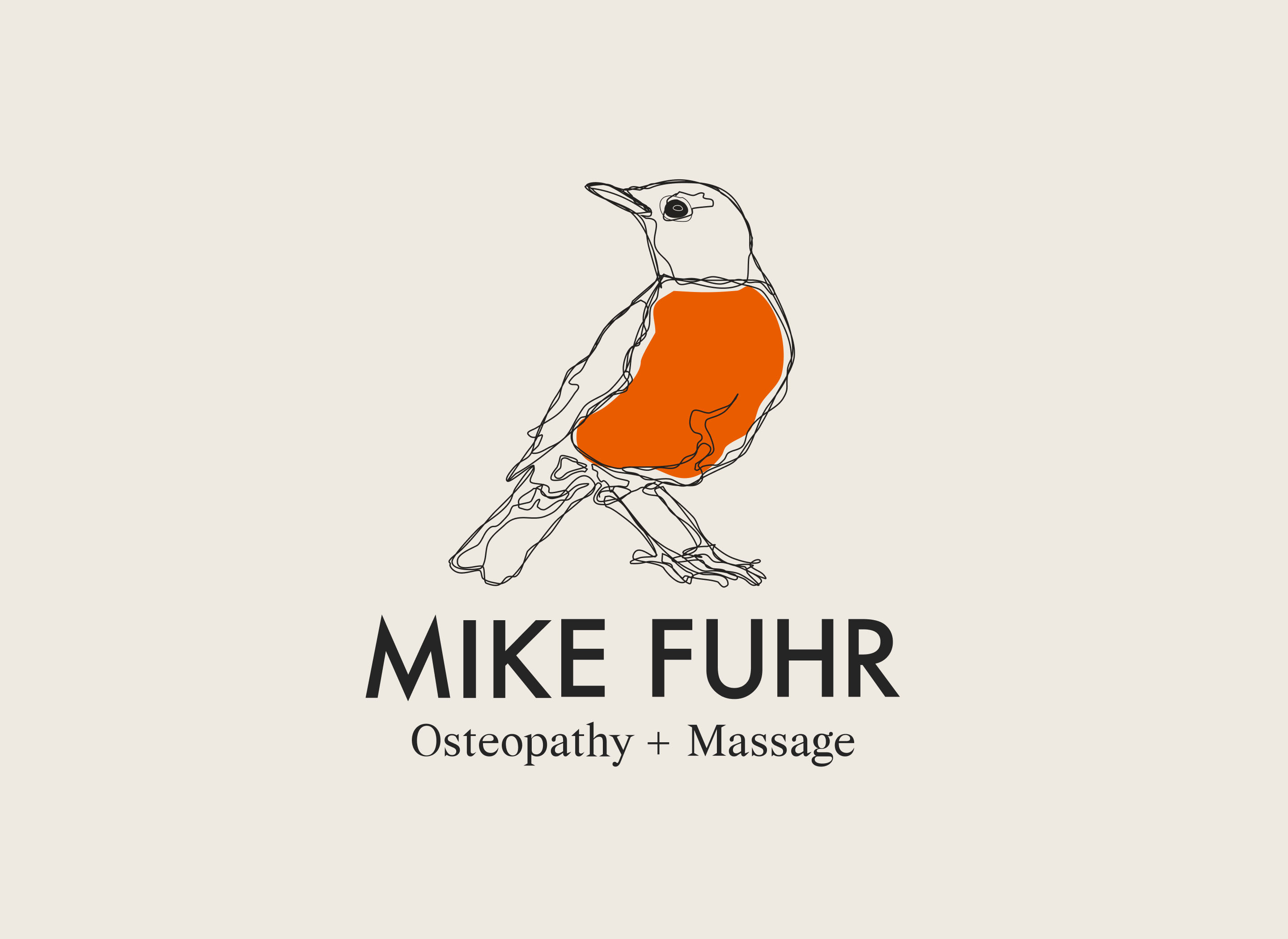
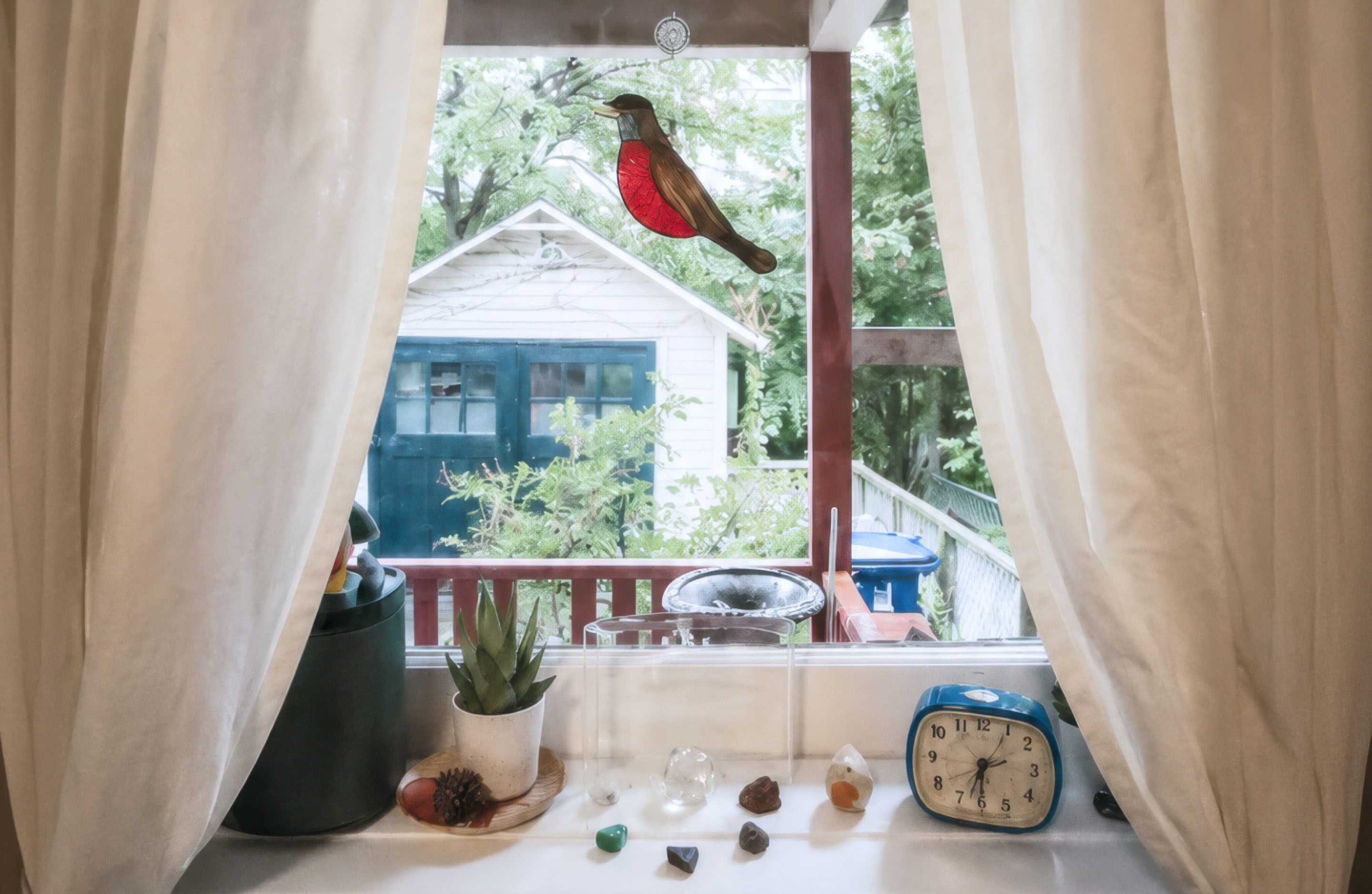
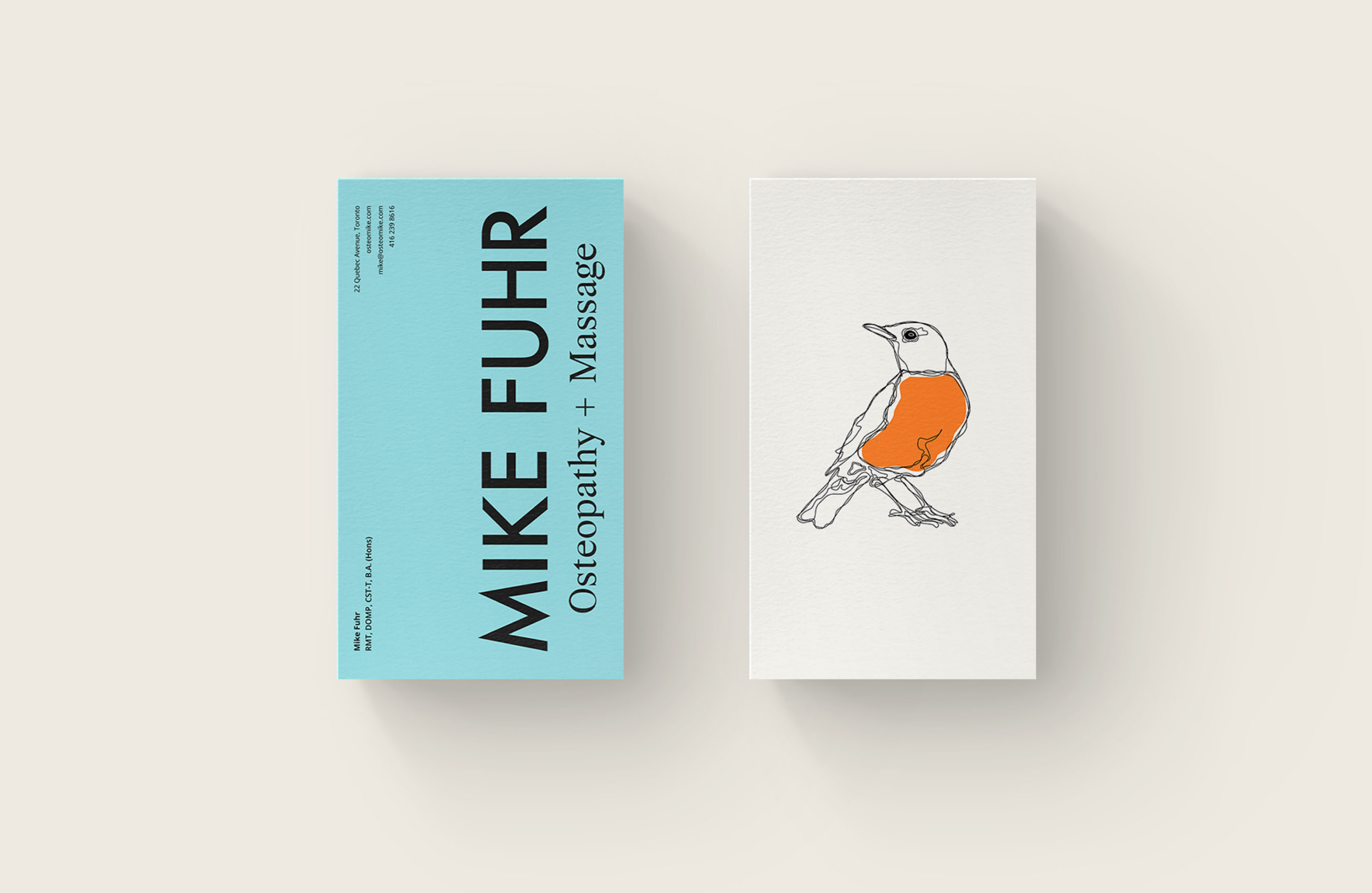
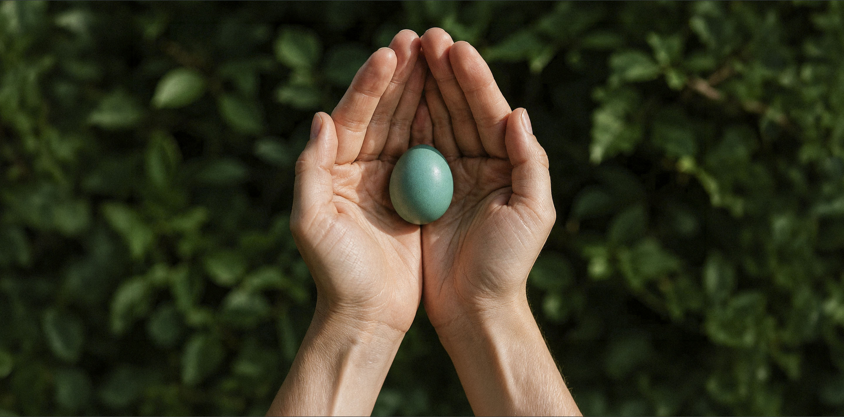
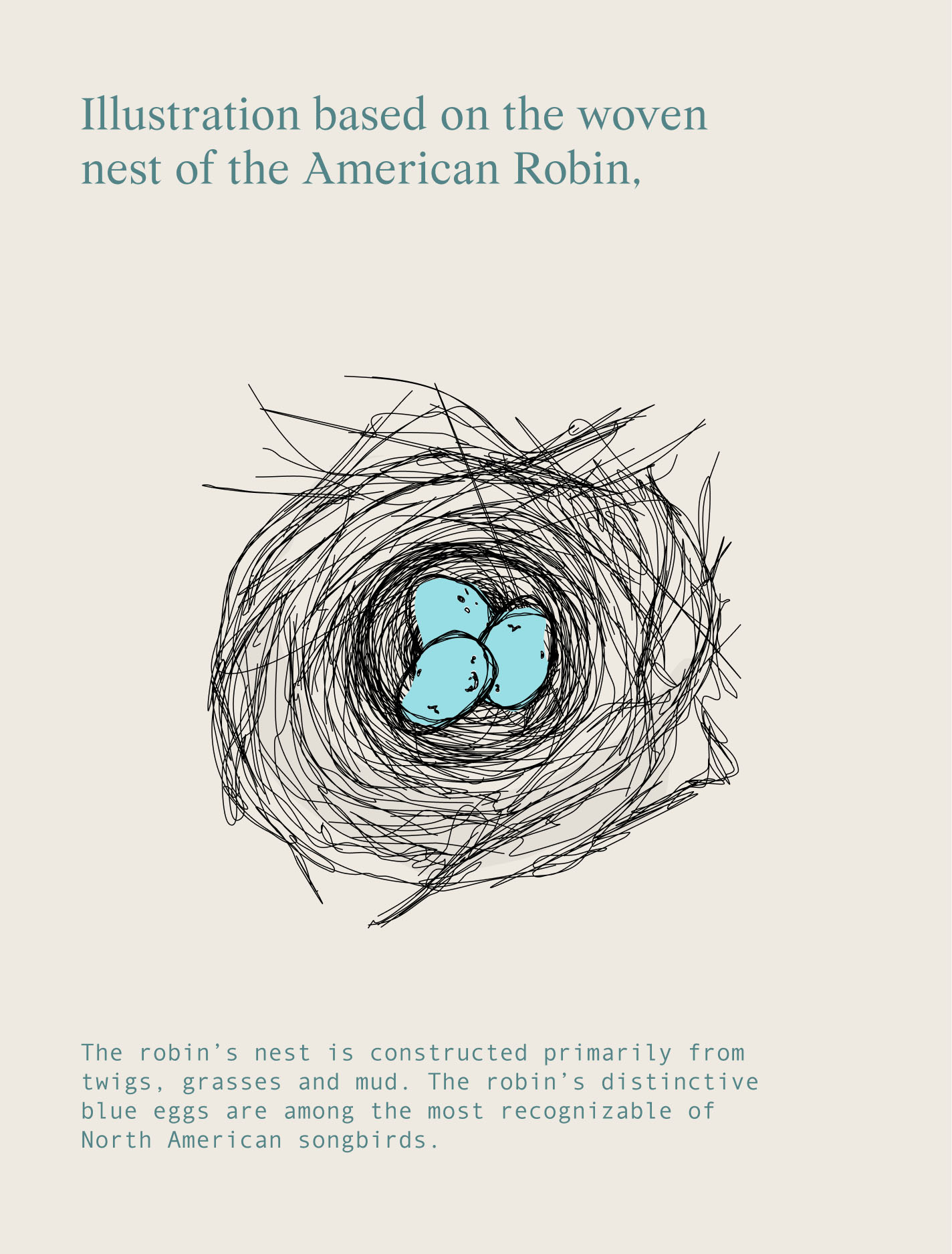
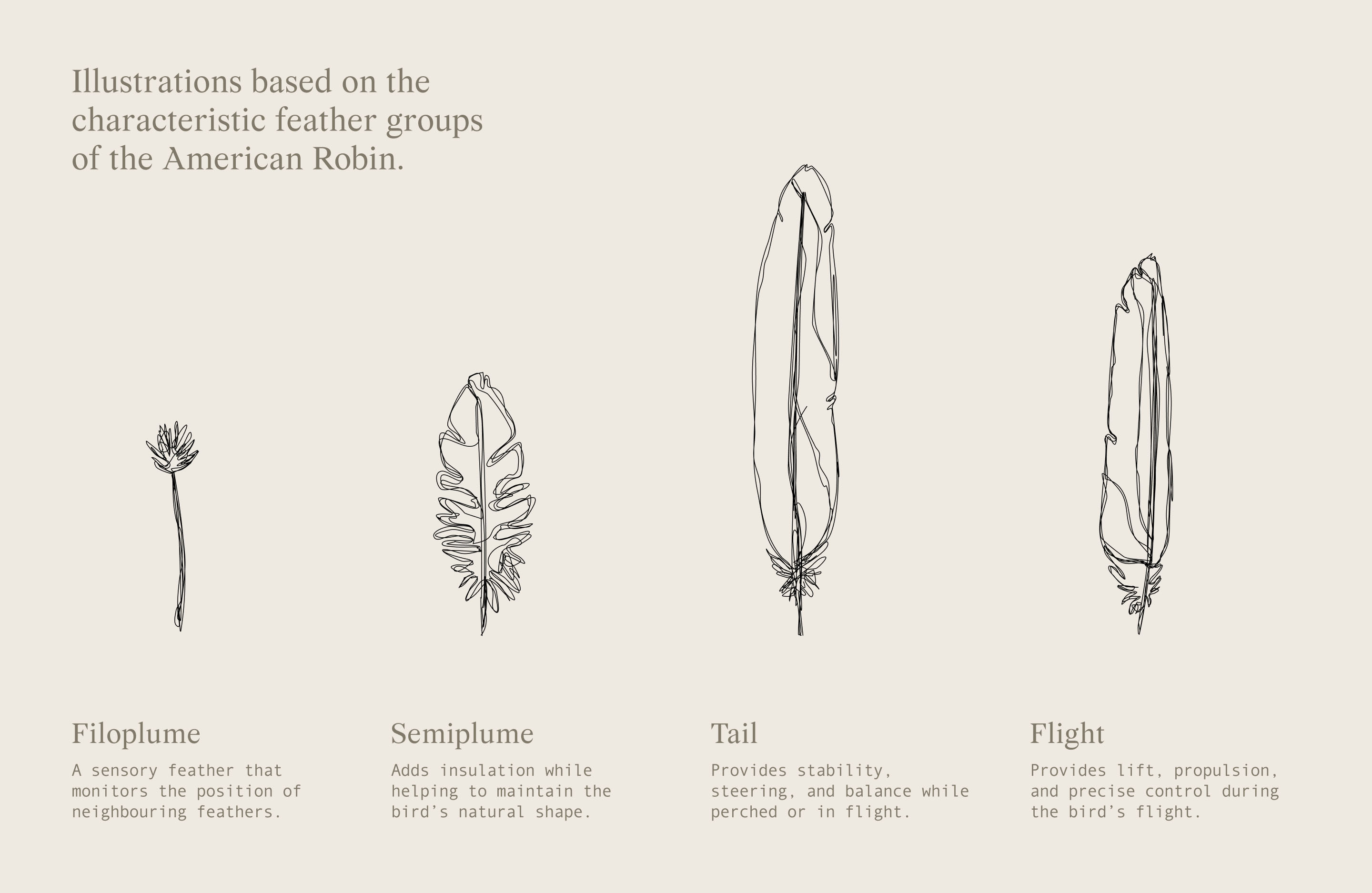
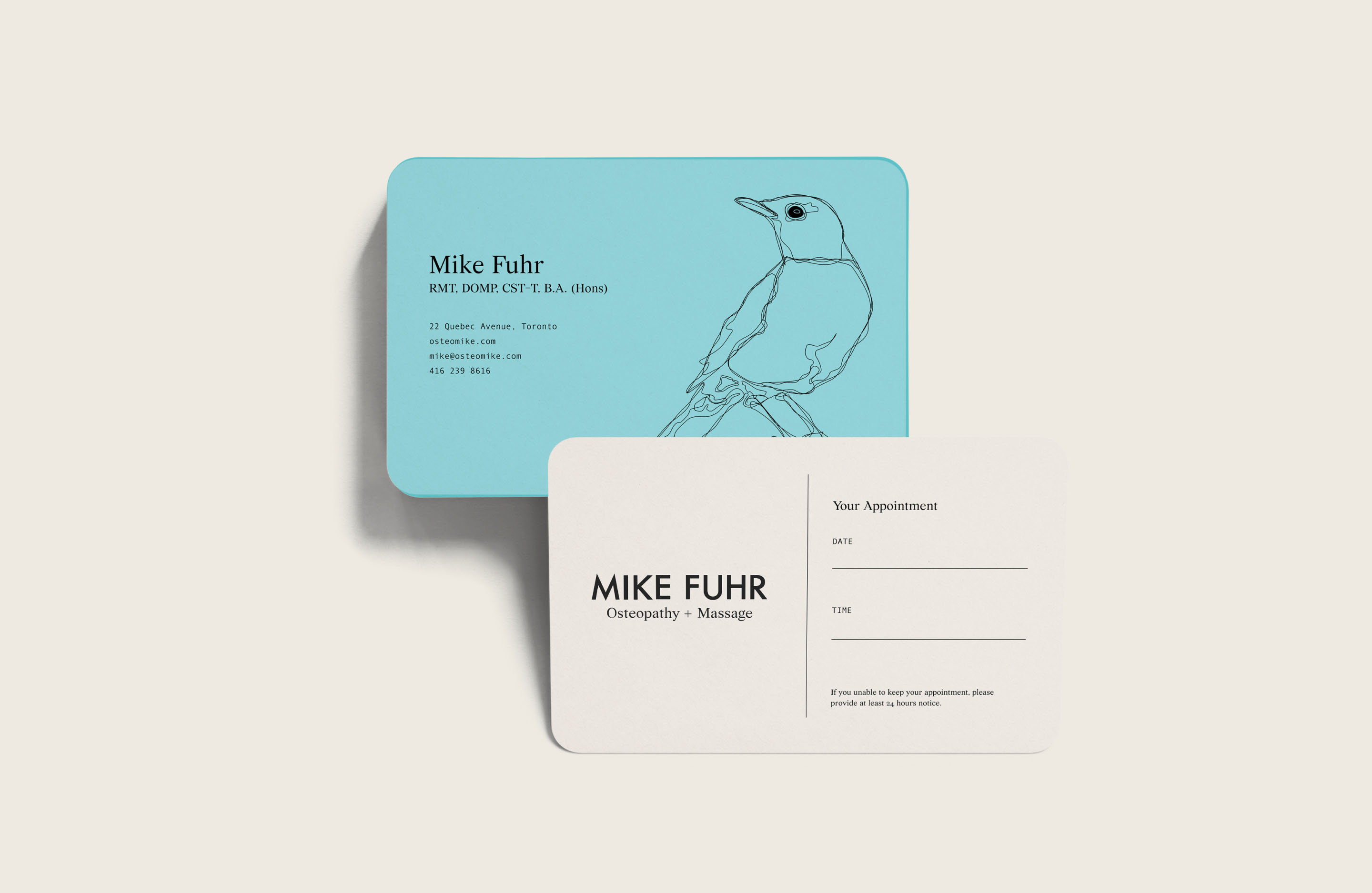
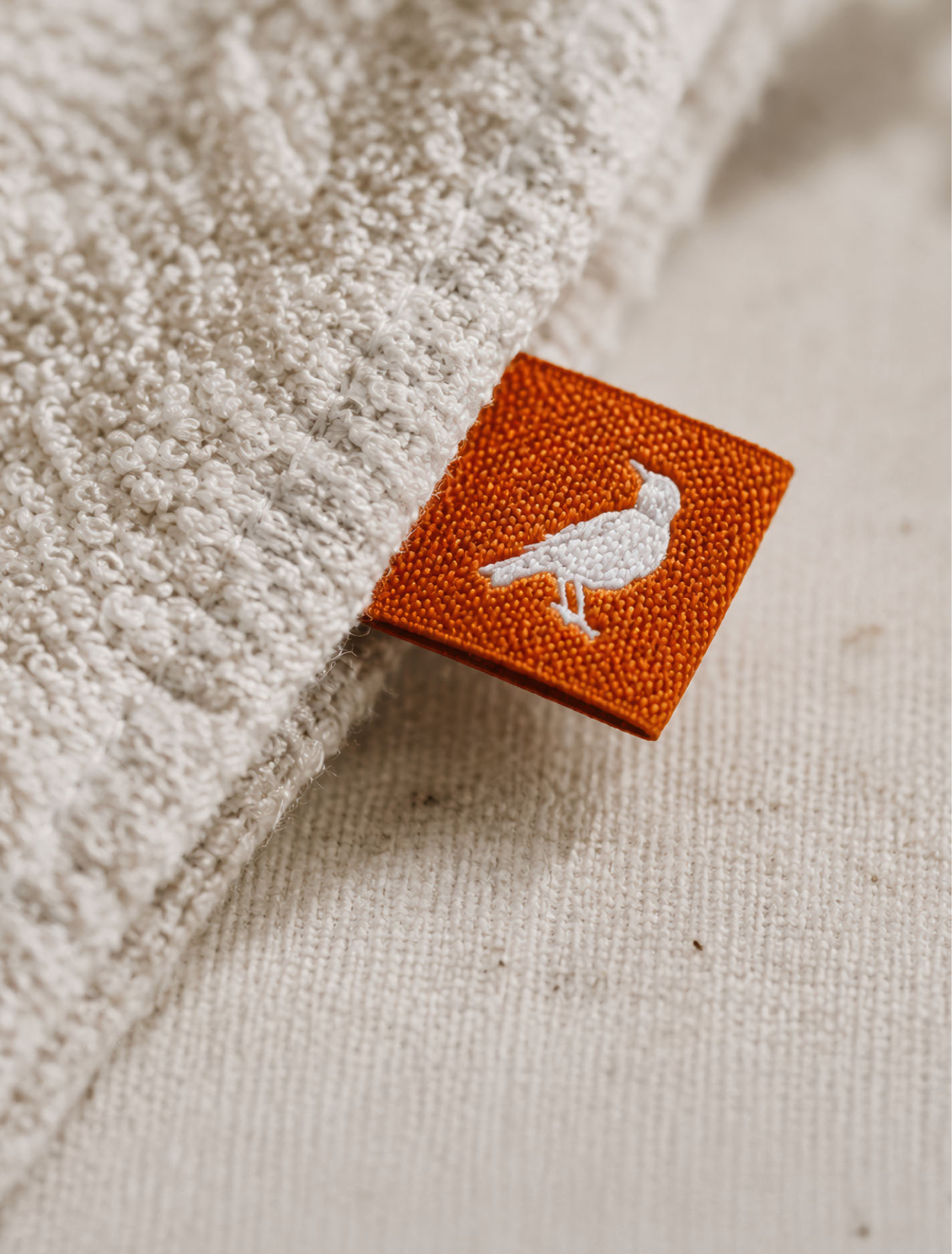
Mike Fuhr’s identity began with one specific request: the American robin had to play a central role. Rather than reduce the bird to a conventional logo mark, I created a hand-drawn robin alongside a broader family of feathers, eggs and nests, allowing the illustration style to become an expressive part of the brand itself.
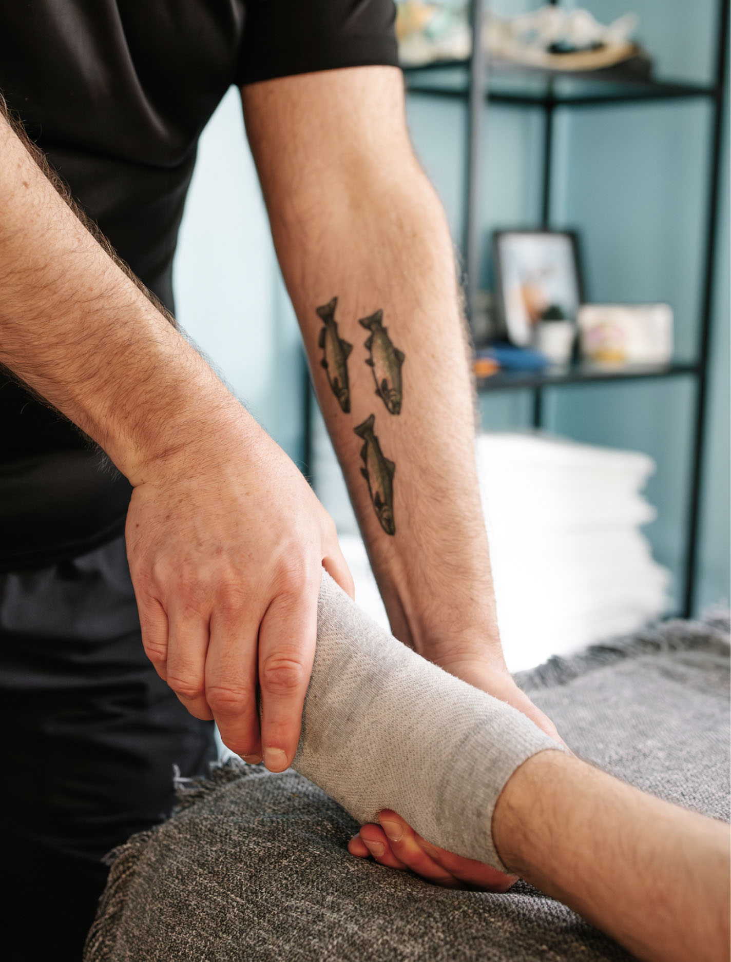
Given the tactile, hands-on nature of Mike’s work, the brand needed a similar sense of physicality. The drawings are deliberately loose and energetic, with imperfect lines and a free-flowing quality that prioritizes warmth and movement over polished precision.
The colour palette is drawn from the robin itself: sharp orange from its breast, distinctive blues inspired by its eggs, and warm neutral browns taken from its plumage. Together, these elements create a highly individual identity that feels personal and approachable while remaining grounded in the nature of Mike’s practice.
Simon helped me realize my dream. I could never, in a million years, imagine anything as "me" as the brand he created for my business. His work is art, and attracts the sort of clients I've always wanted.Mike Fuhr, Owner, Mike Fuhr RMT