K2XO
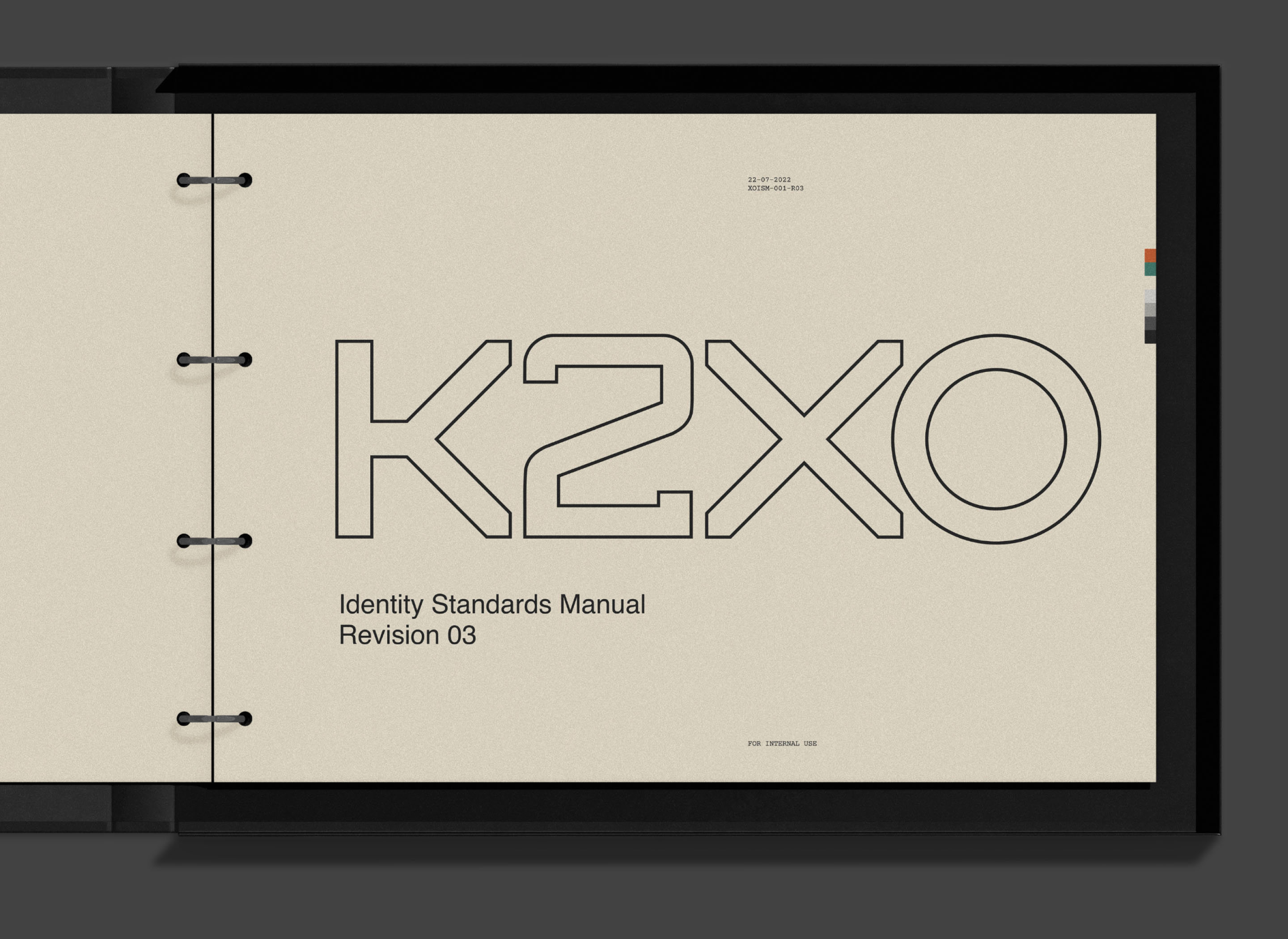
A rebrand of Toronto’s K2 Digital, the K2XO visual identity was developed partly in response to an industry often preoccupied with semantics, inventing proprietary language for services and processes that are broadly shared. The aim was to put the emphasis back where it belonged: on the quality of the work itself.
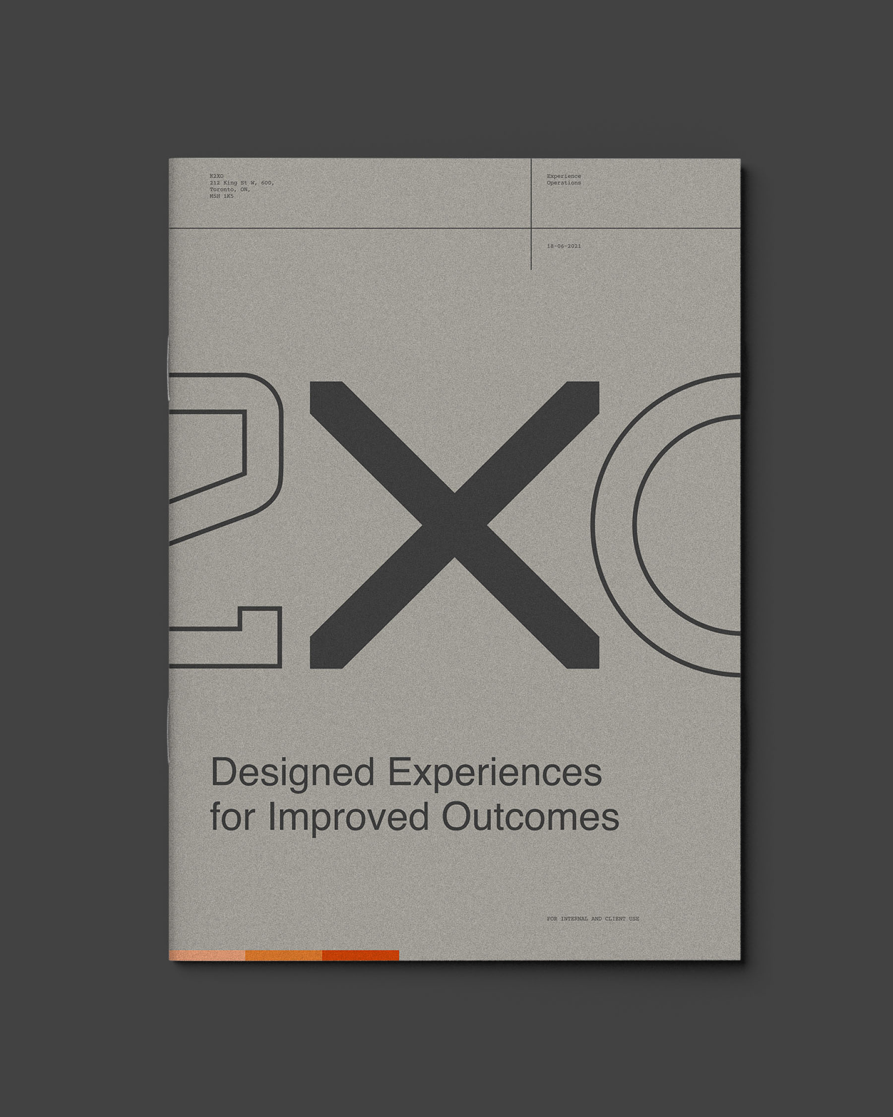
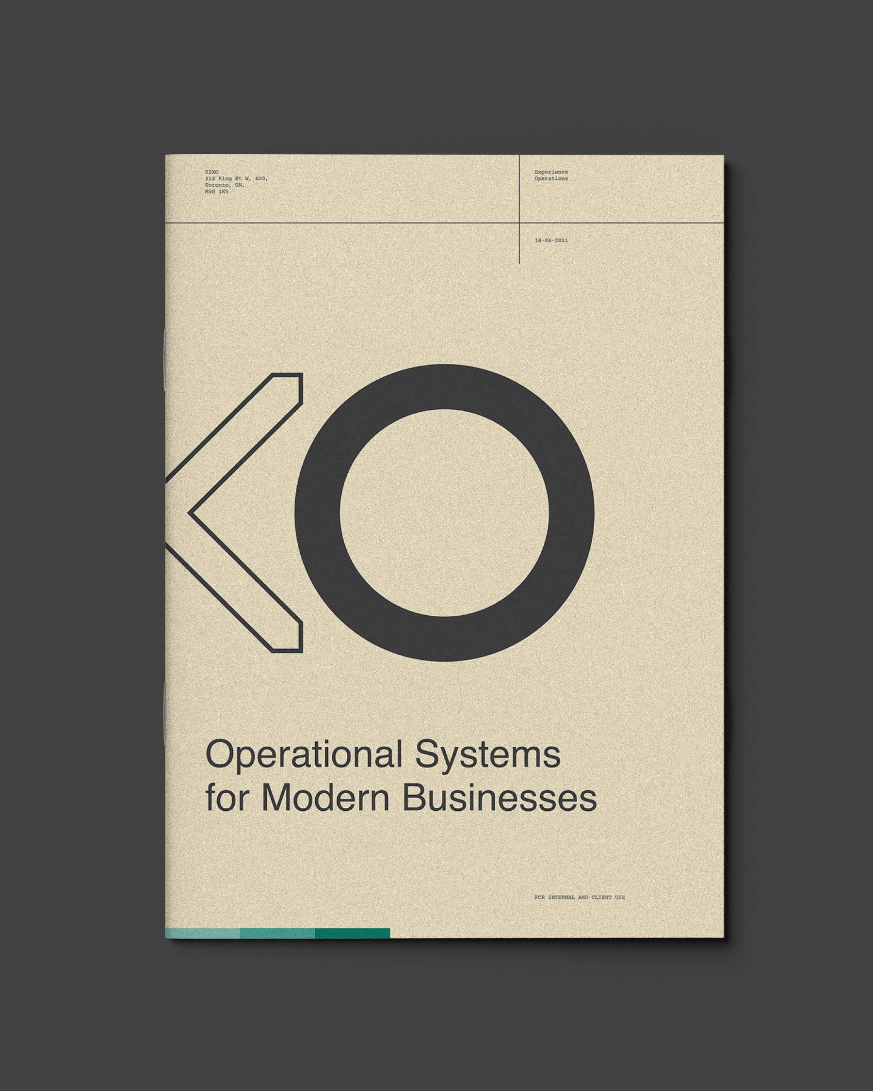
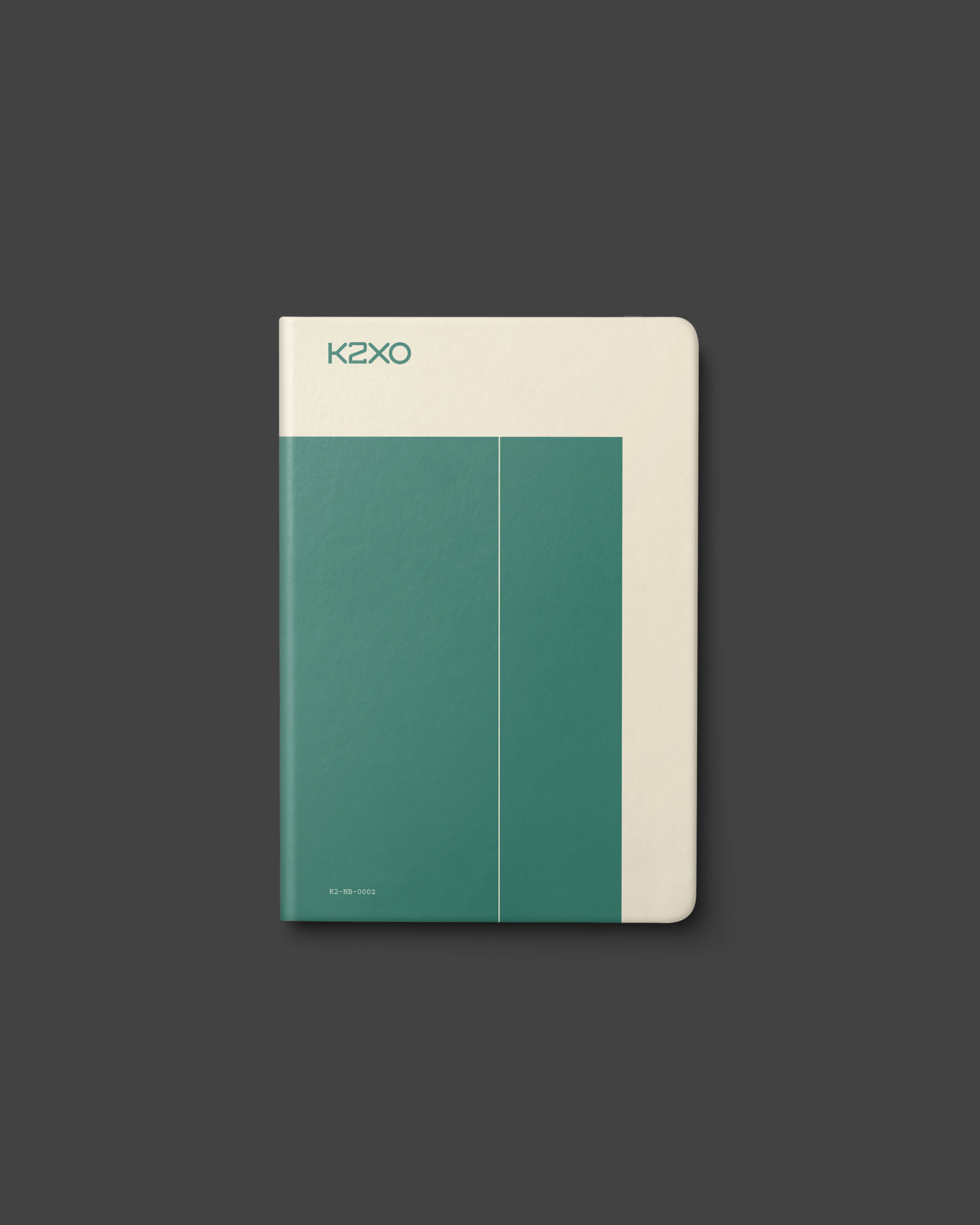
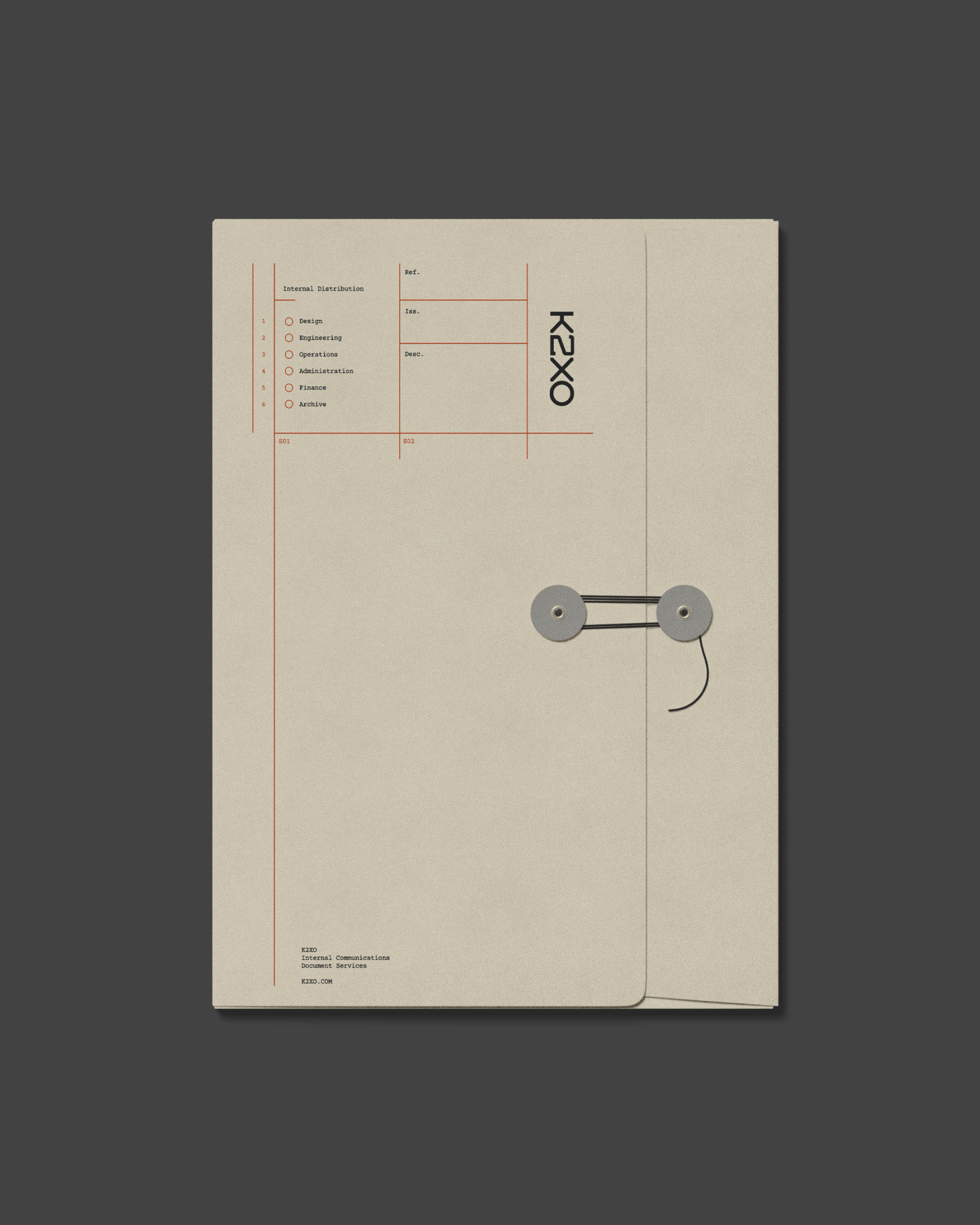
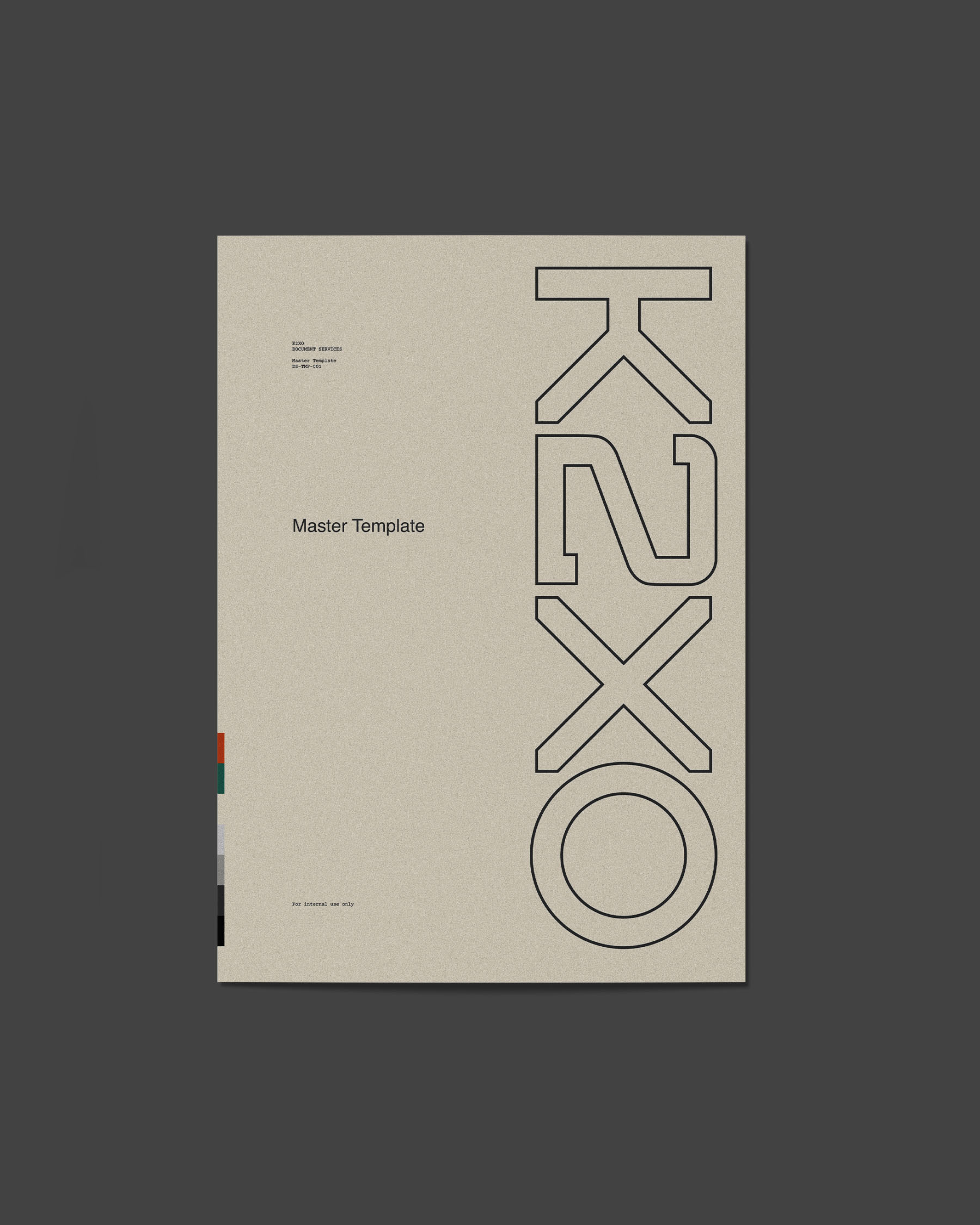
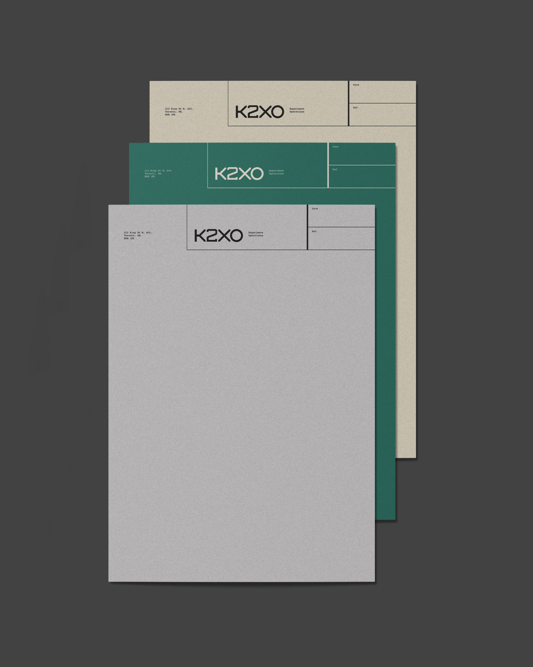
The new name reflects that directness. X and O stand simply for eXperience and Operations, the two areas around which K2XO’s offering is organized. Visually, the identity takes inspiration from the pre-digital branding of companies such as IBM and Olivetti: functional and pragmatic, with broad variation between applications yet possessing a clear overall coherence.
This approach felt particularly relevant in an agency landscape dominated by identities refined to the point of uniformity. To that end, typography, colour, scale and composition were allowed to shift considerably between applications rather than conform to a rigid template. The test for any piece of branded material was simple: does this look like it came from K2XO? If the answer was yes, it belonged.
Simon has the remarkable ability to make sophisticated concepts feel simple, confident and inevitable. But his thinking goes well beyond visual design – Simon's work has set the tone for how we think about our strategy, how we sell our ideas and, ultimately, how we deliver for our clients.Eric Yu, VP Strategy, K2XO